
I have to keep this short as I have to run out the door.
Well, that was odd. I get out a post around lunchtime mentioning that if the team has a certain theme this year, it should be one that indicates the desire of the team to go out and win. Not anything that would suggest entitlement. Shortly afterwards, Kevin Gorman blog posts about morning practice, and…
Pitt has chosen “Prove It†as a motto for the season…
I’m good with that. That’s what the team has to do. Prove it deserves darkhorse status to win the Big East. Prove it deserves the hype as a team on the rise. Prove it deserves being ranked 19th in Sports Illustrated’s preseason rankings.
Back to all the goodies in the Gorman post, which I’m sure most of you will go and read in full. Kinder already threw another scare into everyone by slipping and twisting/tweaking his knee a bit in drills.
At about 10 a.m., Kinder slipped on a route over the middle and came up hobbled, limping back and taking a knee.
“I just slipped and twisted my knee slightly,†Kinder said. “I’ll be fine. I was a little nervous at first, but when I got up I was all right. I finished practice, so I was all right.â€
Kinder actually caught a pass in stride and ran without any apparent problems, but he realizes that the mental aspect of the injury will be the hardest part to overcome.
Kinder isn’t more talented than a lot of the receivers Pitt has. He does, however, have one of the best work ethics on the team and is a leader. His presence just makes the receiving corps that much stronger.
Kevin Harper, the freshman kicker from Mentor, OH (just down the road from me), is almost certainly going to be redshirted behind Conor Lee. Still he was showing a strong leg.
Being that it was a helmets-only practice, one of the most impressive showings was by freshman kicker Kevin Harper. He blasted a pair of 32-yard field goals so high through the uprights and onto the hovering catwalk, a first from what we’ve seen.
Mick Williams is looking svelte and toned.
I can’t imagine for ONE SECOND they gave a SCHOLARSHIP to a KICKER to redshirt him. And if we put out any of those guys who could only get it to the 10, and then only on a line drive, instead of a kicker on scholarship, we deserve to lose every game this season. You play the kids who BEST help you – no matter what class they’re in. If this guy CRUSHES the ball, i don’t care if the only thing he does is kick off. Think of all the hudreds of yards he can get us with a kickoff that lands 5 yds deep in the endzone after taking a high, arching path. Especially all the kick offs we’re going to have this year when shady is ringin up half on hundred on people…. 🙂
This is the year we have all marked our calendars. So lets go support of Panthers
Could not agree more – we look like Navy and Tulsa combined.
It will really be tough going in the next few years with all these bad recruiting classes… get real.
The block letter PITT is the most historically significant logo we have; I’ll just leave it a that.
“Obviously not the primary reason for choosing a program over another…”
As for your comment:
“The block letter PITT is the most historically significant logo we have…”
That’s crazy-talk.
I reiterate that I don’t think the uniforms make any real difference in a how a team plays. However, I do believe the current incarnation is hideous and I do believe players care how they look (as petty as it may seem).
BTW – I never said anything about the script, but… Would I like to see the return of the script? Hell yes (although I don’t think it will happen under Pederson or Nordenberg’s watch).
Would I be satisfied if it didn’t look like our uniforms were designed with a crayon and a cocktail napkin on the dashboard of Ronnie Yinzer’s IROC? Most definitely.
I guess my biggest gripe about them is that they just look…I don’t know…ordinary and generic.
That was one thing I do like about the throwbacks…it was an easily recognizable color scheme. In fact, it was almost iconic in the fact that you looked at it, saw royal blue jerseys, mustard-colored helmets and automatically thought “Pitt”. You didn’t need to see the script logo on the side of the helmets.
And while I don’t think the uniforms will ever really be the determining factor in getting a kid now, at some point, they were also saying the same things about Michigan’s maize and blue, Notre Dame’s blue and gold and even that other school’s blue and white. There are some kids who still pick schools because they – for lack of a better term – have always wanted “to wear the uniform”.
I’m the troll?!? Funny.
Nice to see fans for script keeps their page current. I’ll tell you one thing, the message they put forth on that site is a profound tall tale.
Let me be clear here, the script is a damn cool logo, that’s not debatable. What I don’t like about this fascination with the script is that it is held up as if it is the first, best and only Pitt logo and that’s just not true. It is revered so highly among Pitt fans that we’ll manufacture backlash against anything that isn’t mustard and royal.
Case in point, your fav. page- Fans For Script panned the gold unis when Pitt wore them against Louisville in ’06. If they don’t like the gold- fine, that’s their opinion -but to compare the gold incarnation of the unis as inferior to the ever popular script Pitt only shows that the historical context of Pitt’s uniform choice is already lost on today’s Pitt fans, and I’m against that. I’m not at all against the script, but this hype of putting the script Pitt on some kind of historical pedistal is insanity.
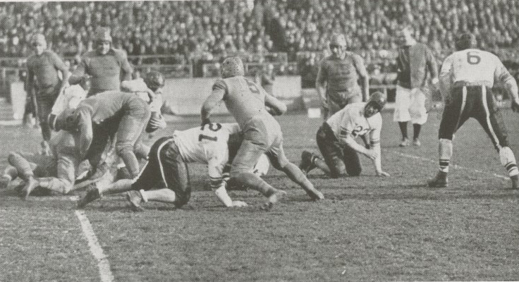
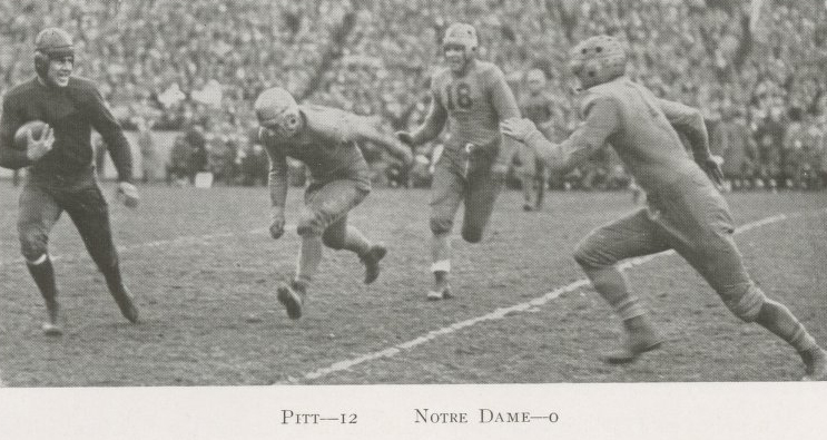
For the record the gold uniforms were used as a change of pace scheme for several seasons in the 1930s and 1940s – several seasons… just like all of Pitt’s uniform schemes.
1932 Stanford @ Pitt
link to farm2.static.flickr.com
1932
link to farm2.static.flickr.com
You will see why they wanted to ‘change pace’ when you check their abominable 1932 main jerseys – horrible.
link to farm2.static.flickr.com
To me (and I’m pretty sure I’m the sole person with this view) the modern all-gold getups are the classic Pitt throwback.
I don’t care at all if you love/hate the color scheme, if you love/hate the logo, or the monochrome thing, or the jersey #’s- that’s your right as a fan. What I’m getting tired of are the historical falsehoods that accompany praising the script as somehow Pitt’s main historical logo. In essence I’m trying to get forth the point that in this case coolest looking and most popular scheme does not automatically equate to historical significance. That’s what I believe in and that’s why I’m ranting posting this.
I do hope they bring back the script in the future – for a few seasons at a time – and I also hope to enjoy watching the continued evolution of Pitt football through time.
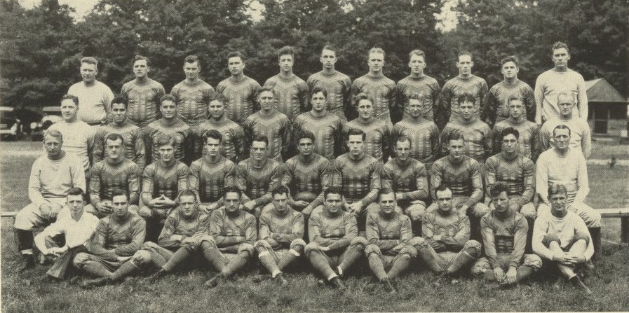
Pitt Baseball 1938
link to farm4.static.flickr.com
Pitt XCountry 1922
link to farm4.static.flickr.com
Hail to Pitt
People outside the program and fan base identify with that script logo and color scheme. Many of the players and much of the fan base prefer it. And it was featured on the cover of SI (when that was more relevant) during the Dorsett and Marino years.
In my opinion, what we can take from this discussion, is that the Pitt administration has failed from a marketing perspective. Programs like Penn State, Ohio State, Alabama, Michigan, USC and Texas have distinctive, well-recognized logos/uniforms/color schemes that have changed little over the years. This stimulates brand recognition (aided mightily by successful programs).
Pitt’s current look is neither distinctive or well-recognized.


Would you look at the arms on this guy? Holy sh*t
Certainly looks to be all the athlete he’s been touted. It’ll be interesting to see his development as a “dual threat.†Pitt’s first since Rod Rutherford who could’ve-should’ve run a bit more under Walt Harris.
…but then, Harris was a throw-first HC, the polar opposite of DW.
See: PG Photo Journal at: link to postgazette.com
Under: Pitt Panthers Media Day From the left, Pitt quarterbacks Tino Sunseri, Greg Cross, Bill Stull, Pat Bostick…