
No kidding. In the interest of infodumping, go here if you feel like seeing detailed images of all the new unis. From the football team to the band, to the cheer and dance to gymnastics (sorry, the unis are on mannequins).
Let’s give AD Scott Barnes some credit since it has been a seeming non-stop slam-fest on him since late-March. He put together a nice spectacle. Kept things under wraps. Really well-coordinated campaign. Made the unveiling of the full athletic department rebranding a full-on celebration of Pitt.
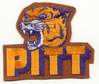
I’ll get this out of the way, now because I’m not trying to be negative or contrary. I just want to restate my position on the script: I don’t really care. I have nothing against it. I know a lot more people feel very passionately about the script Pitt and really wanted it back.
I hated the whole “Pittsburgh not Pitt” attempts. I had no real problem with the block “Pitt” even if it was a bit generic. What I miss, what I would prefer back is the old color scheme over anything else. I liked the royal blue and yellow. That ship has sailed except for throwbacks and retro one-offs.
The rebranding is not just about uniforms.
What might seem like a simple cosmetic change to some represents a widespread rebranding effort that the university’s athletic department hopes will launch the start of a new, successful era.
“It injects a level of enthusiasm and excitement in your program that good things are happening,” Barnes said. “What I love about this mark is we’re honoring the past, but we’re looking forward to the future. I think as you walk around and talk to our student-athletes and our fans, they’re really excited. They’re excited because it’s a new beginning.”
…
Other facility changes include a new hydrotherapy center for the football team, work to Fitzgerald Fieldhouse, an updated locker room for the swimming and diving team, and an exterior facelift of Trees Hall.
“Literally every playing venue and practice venue that we have will get a facelift with the new Pitt script and some other branding elements that attract and inspire pride with our student-athletes, recruits and coaches,” Barnes said. “That’s really the goal in everything we do.”
The script was the school’s primary athletic logo from 1973-96 before the athletic department opted to be referred to as ‘Pittsburgh’ and implemented a panther logo some derisively dubbed “Dino Cat.” In 2005, the athletic department adopted the block Pitt as its primary logo. Barnes said the department and Advent, a Nashville-based branding company, will spend the next 18 months working on secondary marks, which could include a panther logo.
The unveiling was the conclusion of a coordinated effort throughout the day to promote the switch. On Twitter, several athletic department accounts posted photos of former Pitt greats such as Larry Fitzgerald, Darrelle Revis and DeJuan Blair sporting various script merchandise.
The Pete is getting refitted. There will be a new floor, which does look sweet. And the “Cathedral Wall.” The Cathedral will light up after wins. Changes.
Uniforms are only the beginning. Barnes said every practice venue will get a facelift with the new logo.
Perhaps the most impressive new look will be at the Pete, where the Pitt script will be splashed on center court. There were discussions about making it stretch from one 3-point line to the other with the Cathedral of Learning as a backdrop, but officials settled for a more conservative look.
Yet, the Cathedral will not be ignored. The end zone closest to the Pitt bench will feature a photo of the iconic 535-foot skyscraper, surrounded by basketball greats of the past. When the men’s or women’s team wins, the building will light up.
Barnes said the script lettering celebrates Pitt’s history.
“Bringing this iconic logo back evokes a nostalgic feeling of the success we have had in the past,” he said. “It’s the next step in building momentum (for the future).”
Pictures (courtesy of Justin).
Pretty! #PittScript pic.twitter.com/kGOVOA0dPJ
— Justin W. (@NFLGimpy) May 18, 2016
New addition to the Pete pic.twitter.com/AyKCqDi5kn
— Justin W. (@NFLGimpy) May 18, 2016
As noted in one of the articles, a secondary logo is still in the works. That’s always been an issue for Pitt. Even the old style prowling panther or roaring face or the ill-fated panther tooth.
And perhaps that is why the script has resonated so much for so many fans. Beyond simply, “well that was the logo used when Pitt had its resurgence in the 70s and into the early 80s.” Of all the logos, primary and secondary, that script logo seemed to connect much more broadly with fans and alum.
Now some of the uniform unveilings from the show last night.
Basketball was modeled by Mike Young and Jamel Artis.
Let's goooooo pic.twitter.com/HCX5bA0kvq
— Oakland Zoo (@OaklandZoo) May 18, 2016
The all-white cheer uni really popped.
#PittScript in full force. #H2P pic.twitter.com/9xN5il9k8z
— #PittScript (@Pitt_ATHLETICS) May 18, 2016
I’m in no rush to buy brand-new gear, but if the soccer kits are sold, that would be the exception.
Fresh kits??? #PittScript pic.twitter.com/tyNaTsGRoe
— Pitt Men's Soccer (@Pitt_MSOC) May 19, 2016
Tennis
Callie and Katherine killing it in the new uniforms! #PittScript pic.twitter.com/73BtReFOkW
— Pitt Tennis (@Pitt_WTEN) May 18, 2016
Track
Fresh threads! #PittScript pic.twitter.com/pWD3ls3xRz
— Pitt _TF_XC (@Pitt_TF_XC) May 18, 2016
And of course, football.
Nice @THE_BIZ_SHOW pic.twitter.com/R1lNSUrT6d
— Justin W. (@NFLGimpy) May 18, 2016
— Justin W. (@NFLGimpy) May 18, 2016
For those hoping that the throwback unis would be revealed, no such luck. That of course makes sense. That would have overshadowed everything else. That’s going to happen. Closer to the start of the season.
They can lose the gold pants forever!
I do like the new BB court design though, as well as most of the other uniforms.
This was very well done.
The facility changes are a large undertaking, glad to see all sports are included.
Not too sure about the shoulder stripes.
Now what was this in the other thread about UPitt and a goat? I think only Ewes for him.
Block letters. Old school cheerleader outfit like USC is awesome. I wish they made the hoops court cooler. Show me a Pitt script that is huge on the football field. Not a bs script in a circle compliments of carrick jr high art class.
Happy the Script is back however missed the boat by not
bringing back mustard and blue.
Saw this and almost choked on my coffee.
That look was great back in the day, but young folks aren’t buying it now and it is all about sales. Great for a throwback, that is about it.
You want the old colors back, go buy up a bunch of the retro stuff when it comes out. The administration will love whatever sells and brings in the most money.
White is for practice? Tell that to 90% of the teams in the NCAA. They all have a white version of their uniforms. About time Pitt got with the times.
Pitt had sleeve stripes back in the day, so you old school lovers got a taste of the 70-80s jersey there to satisfy your nostalgia, lol.
I predict PITT brings back the mustard and blue for the Penn State game! There was mention (somewhere?) that they would wear throw back unit for one game.
Regarding “Let’s give AD Scott Barnes some credit since it has been a seeming non-stop slam-fest on him since late-March.”
I’m not seeing this. There seemed to be about a week of traditional and online media scrutiny and then it was back to the business of covering the beat. Since then there has been media pieces and tweets puffing up all the great things Stallings has done in terms of staffing, recruiting, retaining and training. Zeise even wrote a puff piece last week about Stallings being right man/right time that was tweeted by the online guys as right on target. Everybody is back to business as usual.
Only national guys are still questioning anything about the Stallings hire.
Nobody continues to question anything about the hiring process. Barnes hasn’t felt any reason to respond to anything regarding it and Gallagher apparently hasn’t compelled him to do anything.
I think Reed of all people did the most insightful, passionate editorials I have seen of the Stallings hire and the shameful “process” that led to it.
Have both uniforms. Why not? Sell merchandise with both sets of colors.
The retros will be worn for Penn State, and other rivalry games. i.e. WVU and Notre Dame.
They will also be worn for any big games, i.e. other Power 5 conference games. Oklahoma State next year.
They will become more and more popular and worn many more times than just once a year.
Things are gonna be ok, come on off that ledge and have a cup of coffee.
I’m not sold on Barnes but give him credit for this one.
Was watching ESPN 30 for 30 on Brian Bosworth, there is a 2 second clip of him essentially body slamming John Congemi, you knew it was Pitt instantly. Hope we at least get the old colors once a year…
2 Penni Graham should not be commenting on anything Pitt-related, go away please
3 Disapointed in football changes but other sports look nice.
H2P
I give it a C-.
If the Retros were out, they would be in HIGH DEMAND compared to anything debuted yesterday.
It’s all about the Benjamins.
However, it’s something you’d expect to see on a discounted Cotton Tee hanging on the back racks at Marshalls.
Not a Game Jersey.
Hopefully, when they debut the clamor from the Masses (aka “the Noise”) will cause Barnes and Co. to rethink.
Oh, and I dislike the mustard and royal. While distinctive, they are just ugly colors.
If Pitt becomes a good football team, the unis won’t matter a bit…
Go Pitt.


And if you like them… you’re not alone.
Penni Graham has given them her blessing.
********
Head Coach’s Wife! ?@CoachsWifeASU 12h12 hours ago
The jersey numbers are an ode to the architecture of The Cathedral of Learning… Which is pretty cool.
********
So there you go. Argument settled.